Data → Analysis → Graph
Rigorous statistics.
Graphs worth
publishing.
Plotwright is a statistics and scientific-graphing workbench for researchers. The same mental model you already know — enter data, choose an analysis, get a figure — with results computed by a peer-reviewed numerical engine.
Full-featured trial · Optional AI assistant · Local-first project files
Optional AI assistant
Ask for an analysis. Get real project sheets.
Plotwright's assistant can inspect the project data you select, run an analysis through the same numerical engine as the interface, and create editable Results and Graph sheets. It orchestrates the work; it does not invent the statistics in chat.
- Auditable outputEvery result lands in the project, ready to inspect and rerun.
- Visible scopeSee which project content will be sent before you press Send.
- Bring your own keyYour OpenAI API key is stored in your browser, used only when you invoke the assistant, and never saved in the project.
Current scope: create analyses and graphs from selected data. Editing an existing graph by chat is not yet supported. OpenAI usage charges may apply.
Scientific guides
Work through the evidence, not a feature checklist.
Short, source-linked examples connect experimental design, exact numerical results and the graph you should inspect.
Paired vs unpaired: the same data, two answers
Ten patients and two drugs show why pairing comes from the design—and why ignoring it changes the uncertainty.
Matched pairs · mean vs signed ranksPaired t test vs Wilcoxon: choose the estimand
Student's ten matched patients show why mean-difference and signed-rank inference answer related but different questions.
Experimental units · nested dataTechnical vs biological replicates: what is n?
Twenty-four assay readings show why four reads from each of three cultures do not make twelve independent replicates.
Repeated measures · missing dataRM ANOVA vs mixed effects: what does one blank remove?
Thirty-nine visible ChickWeight measurements show why complete-case ANOVA drops an entire subject and what a random-intercept model keeps.
Independent groups · unequal variancesWelch vs Student's: which variance model?
A transparent 24-value stress test shows why a preliminary variance-test P value should not choose the final t test.
Descriptive statistics · error barsSD vs SEM: spread is not precision
Twenty-five visible values show why SEM narrows as sample size grows while the observed spread can remain nearly unchanged.
Distribution diagnostics · sample sizeShapiro–Wilk and Q–Q plots: P > 0.05 is not proof
One fixed mildly skewed sequence passes at n = 12 and fails at n = 48, showing why the plot and model context still matter.
Independent groups · rank methodsMann–Whitney U: not automatically a median test
The canonical 15-observation example shows what U counts, how it becomes a probability of superiority, and when a location shift interpretation is defensible.
Paired variables · correlationPearson vs Spearman: linear or monotonic?
R's nine-lot tuna example shows why the scientific estimand and scatterplot—not a normality-test P value—choose the coefficient.
Method comparison · agreementBland–Altman vs correlation: does high r mean agreement?
The original 17-person PEFR example pairs r = 0.943 with limits of agreement spanning roughly −78 to +74 L/min.
Categorical data · 2×2 tablesFisher exact vs chi-square: inspect expected counts
R's eight-cup tea-tasting example shows why expected—not observed—counts and sampling design choose the inference rule.
Regression · data visualizationAnscombe's quartet: graph before you conclude
Four datasets share a regression summary while revealing four radically different structures on a scatter plot.
Pharmacology · nonlinear regressionIC50 and EC50: fit the curve, not a line
A seven-concentration 4PL example shows how to fit, check and report a potency midpoint with a profile-likelihood confidence interval.
Survival analysis · censoringKaplan-Meier curves: events, censoring and risk sets
A canonical leukemia dataset shows why the curve falls, what censor marks change, and what a log-rank P value cannot tell you.
Diagnostic accuracy · ROCROC and AUC: discrimination is not a cutoff
The canonical 109-image example connects AUC to ranking, then shows how one threshold trades sensitivity against specificity.
Multiple groups · one-way ANOVAOne-way ANOVA and Tukey: the F test is only the start
The complete 30-observation PlantGrowth benchmark separates the omnibus result from adjusted pairwise differences and simultaneous confidence intervals.
Multiple groups · parametric vs rank-basedANOVA vs Kruskal–Wallis: means or ranks?
The same 30 PlantGrowth observations show why a normality-test P value does not automatically choose between different null hypotheses.
Multiple comparisons · control designsTukey vs Dunnett: every pair or each versus control?
The same 30 PlantGrowth observations show how the declared comparison family changes simultaneous intervals and adjusted P values.
Factorial designs · two-way ANOVATwo-way ANOVA: interpret the interaction first
All 60 ToothGrowth observations show why a significant interaction changes how main effects and follow-up comparisons should be reported.
The workflow
Three steps, the way you think about your data.
Nothing to relearn. Plotwright keeps the analysis-to-figure pipeline that scientific work is built around, and makes every step reproducible.
Structured data tables
Purpose-built tables for XY, grouped, contingency, survival and nested data — so an analysis always knows what your columns mean.
Statistics you can defend
t-tests, ANOVA, regression, survival, dose-response and more — computed by a numerical engine validated against published reference datasets.
Inspect the benchmarks →Publication-ready figures
Every result becomes an editable graph and layout, styled to journal standards and exported as vector art.
Made for figures
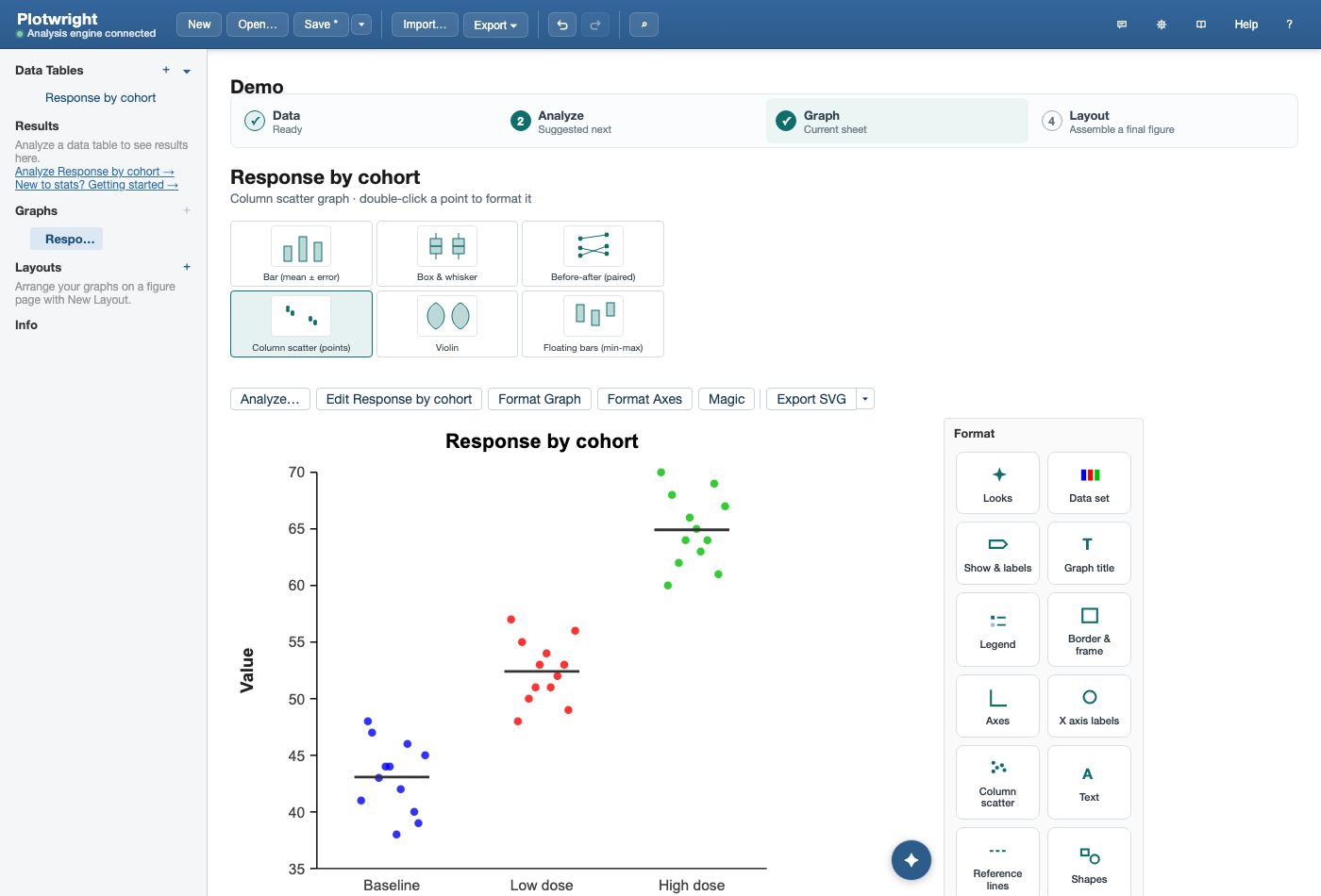
Control every mark on the page.
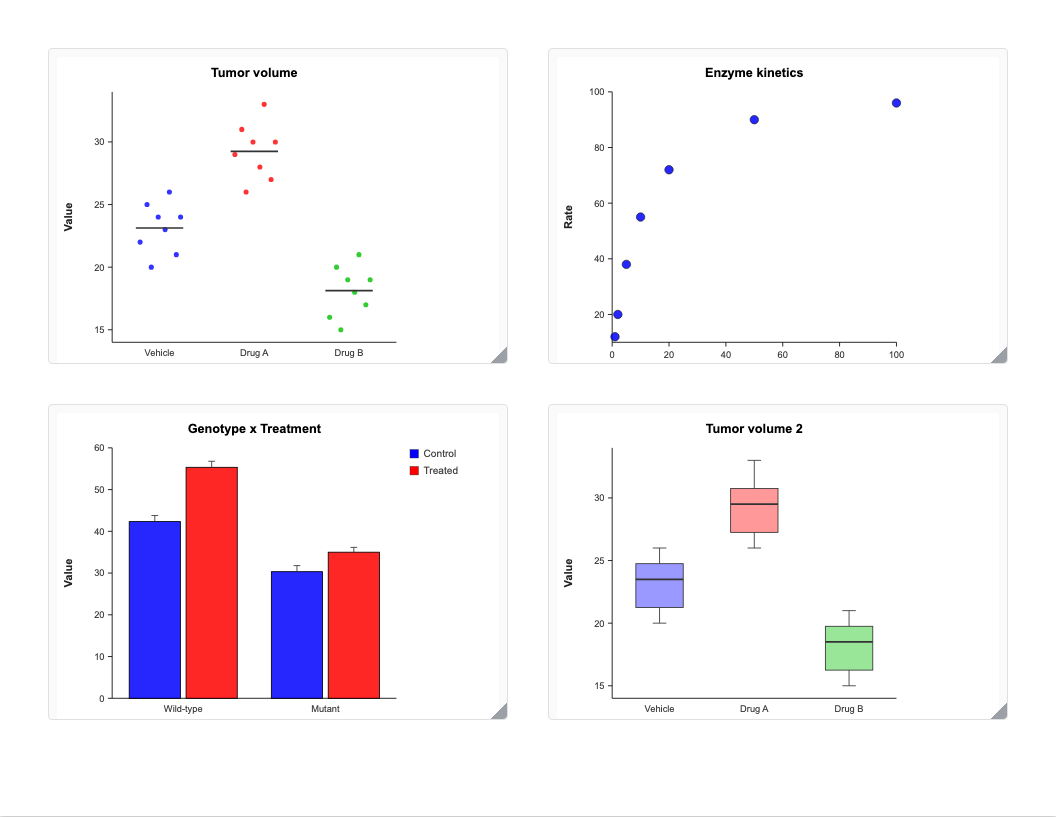
Symbols, error bars, connecting lines, axis breaks, annotations and legends — each is directly editable, with sensible defaults that already look like a finished figure.
Try the full workbench for two weeks.
Everything unlocked, no card required. Keep your projects open and export forever — subscribing simply re-enables new analyses when your trial ends.